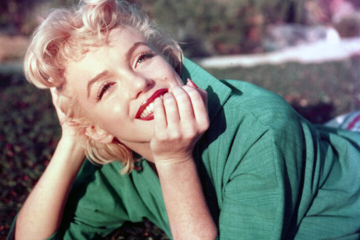


Mocha Mousse, Peach Fuzz and Viva Magenta… Pantone has unveiled the 2026 Color of the Year: Cloud Dancer, a delicate and refined shade of white. The hue did not win unanimous approval, beyond its apparent simplicity.
Each year since 1999, Pantone, a company founded in the United States in the 1960s and known for its Pantone Matching System made up of several thousand colors, reveals the ultimate trend shade. A color expected to be seen everywhere, one that could inspire all artistic fields—from design and decoration to fashion and lifestyle in general. Inspiring and popular, this shade is also meant to reflect the overall mood of the coming year, whether soft, joyful or understated.
In 2025, Pantone highlighted Mocha Mousse, a warm brown that embodies a sensory refuge. The previous edition celebrated Peach Fuzz, a soft shade between pink and orange, evoking the velvety peach. In a period of uncertainty, it symbolized tenderness, kindness and togetherness. In 2023, Pantone celebrated Viva Magenta, a bold, joyful and stimulating carmine red representing “a new world” after COVID.
While all these recent colors evoke specific themes tied to their time – along with evocative emotions—the 2026 shade has not convinced the public. Pantone has chosen Cloud Dancer, a soft, pure and slightly felted white, somewhere between classic white and a subtly creamy white.
Political controversy
It is the first time the American company has chosen a white as Color of the Year. Pantone 11-4201, the shade’s code, is associated with ideas of purity, letting go of the superfluous and a neutrality linked to the pursuit of balance. It suggests the need to create visually calm and soothing spaces, and represents a blank page, a fresh start.
“Pantone 11-4201 Cloud Dancer symbolizes a soothing influence in a society rediscovering the value of quiet reflection. A bubbling white imbued with serenity, it invites relaxation and true focus, allowing the mind to wander and creativity to breathe,” the company explains on Instagram.
Shortly after its presentation on December 5, the color attracted harsh criticism from part of the public. Many people were not inspired by the shade, even preferring Ikea’s Rebel Pink, a bright pale pink. Many reacted on social media by mocking the fact that it was simply… white. Some even concluded that Cloud Dancer was not a color at all.
“The fact that the Color of the Year is colorless is a sign of recession”; “At a time when color is used to express culture, diversity, emotion and innovation, choosing a white-based shade feels, at best, disconnected”; “Also the color of abandonment”; “Pantone’s worst choice, so boring”… On social platforms, users didn’t hesitate to criticize the blandness of the shade and what it represents.
Click here to read the full article on Luxus Magazine.
Featured photo : Pantone